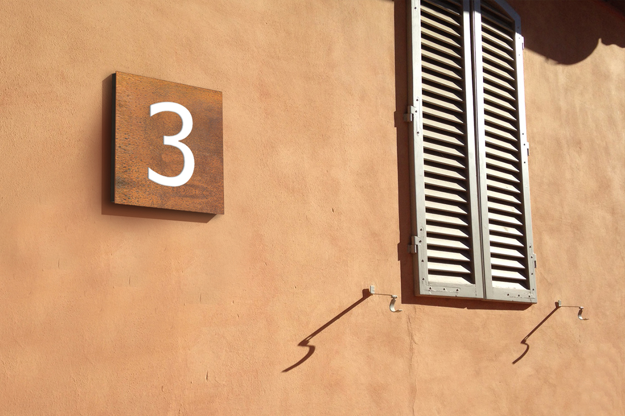
The project has been designed considering the needs related to directional signs combined with the landscape context, with the aim of living and making the place alive. As a distinctive element of the signage project, we used COR-TEN steel as the main material, a visually warm material which matched the colors of Novartis (GSK) site and Sienese territory.

Identify and rationalize the pedestrian flows within Novartis site

Facilitate the use of information for visitors and internal staff

Highlight points of interest and public places

Highlight the location of each building

Clearly identify parking and entry / exit areas
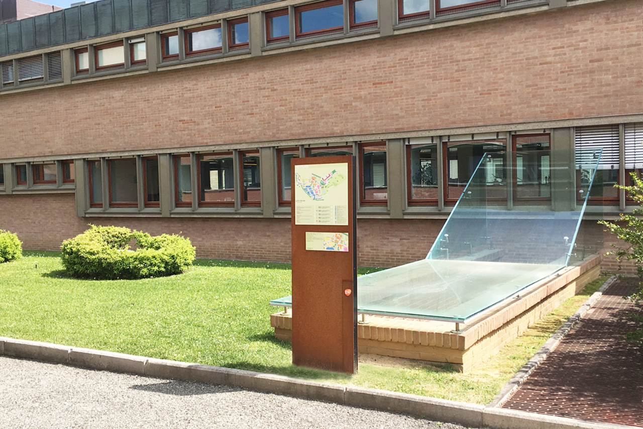
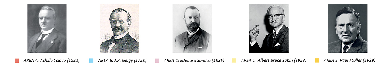
FLEX designed also Novartis masterplan (GSK). The Novartis site (GSK) is divided into 5 colored areas to allow movements and searching easier and faster. The areas are indicated on the masterplan (map) and on the signs so as to help the user to find the points of interest.
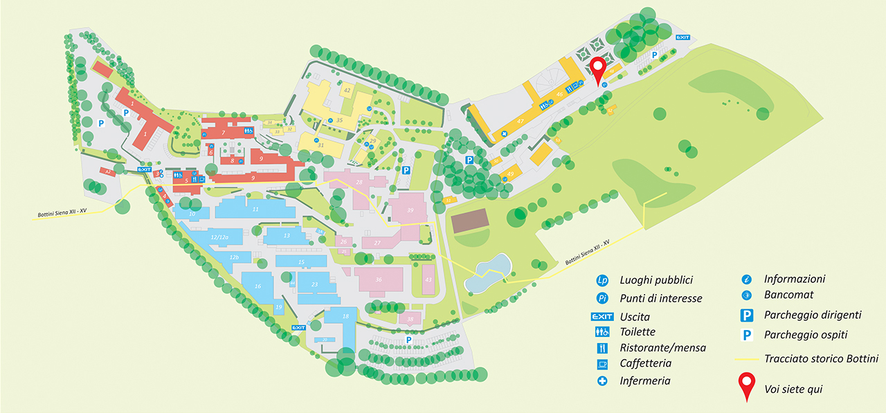
The division of the areas has been further customized, giving the areas the names of important and historical people in the field of medicine, linked to the history of vaccines
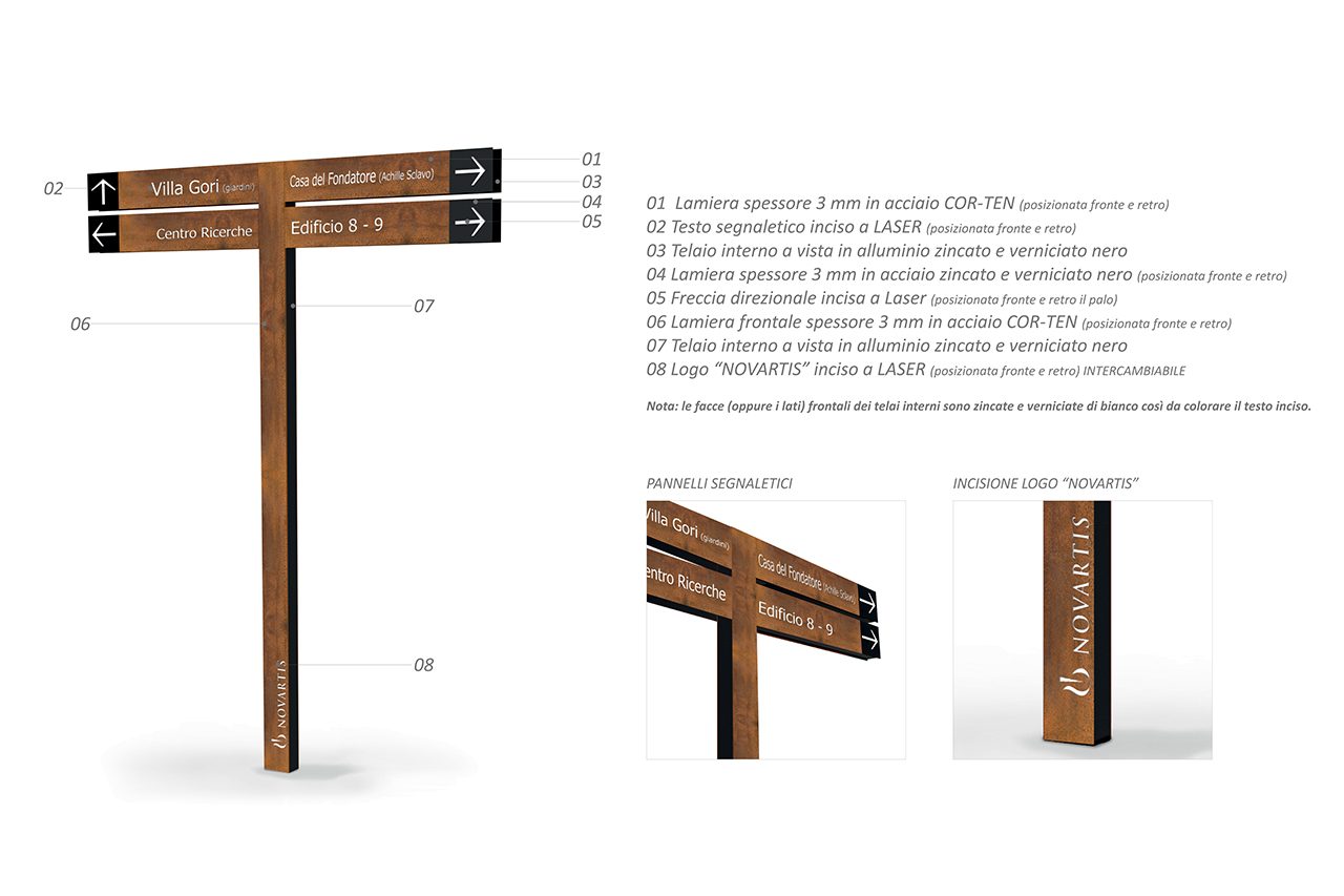
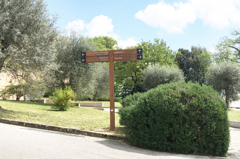
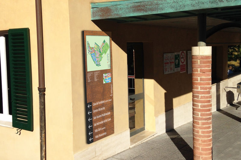
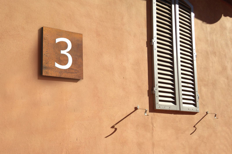
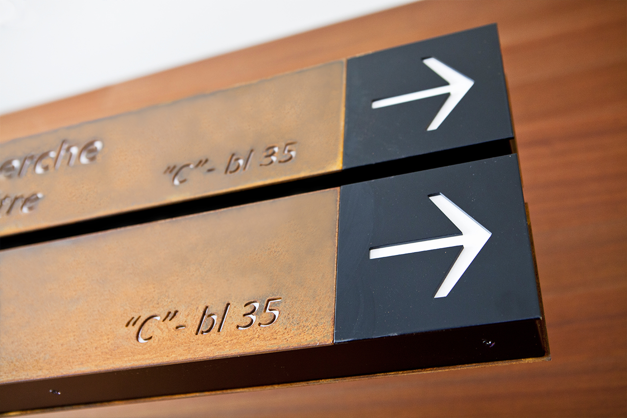
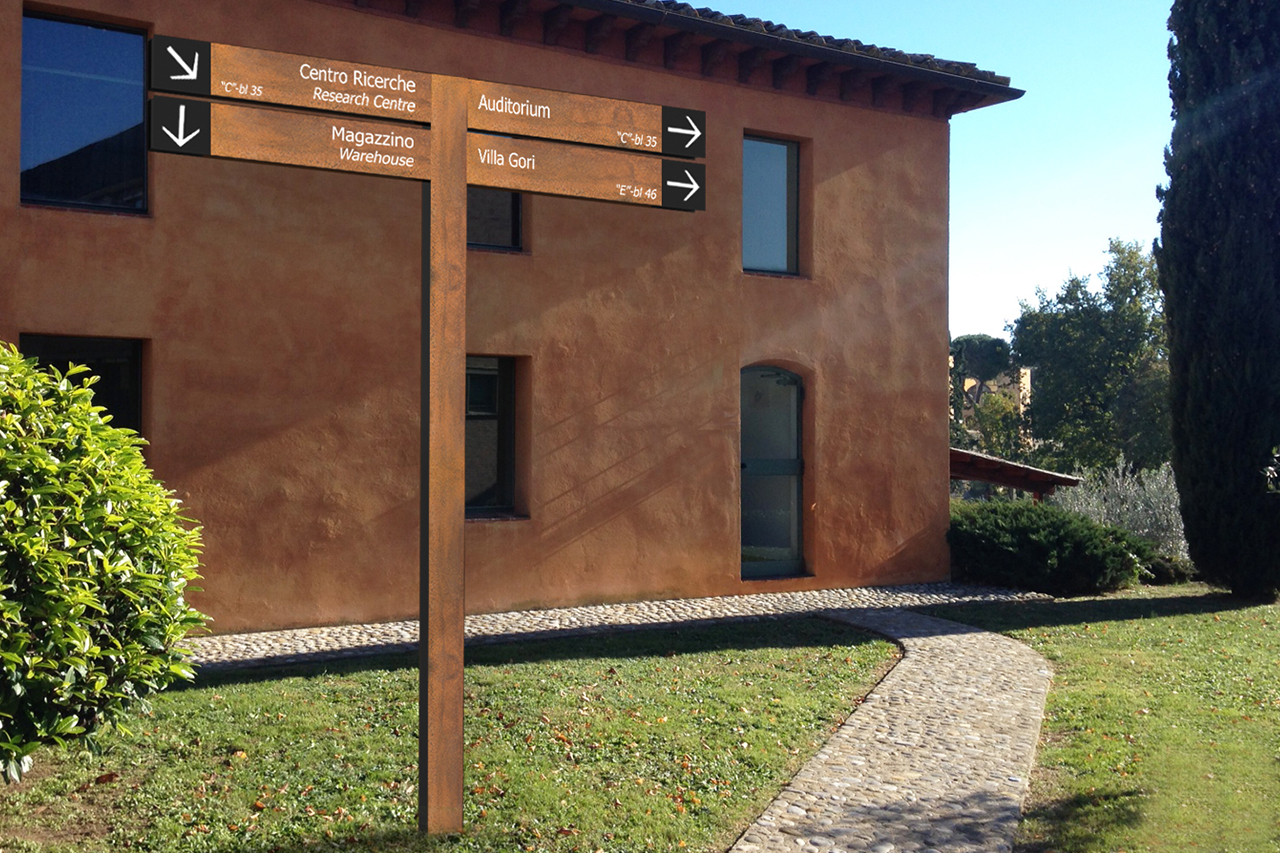
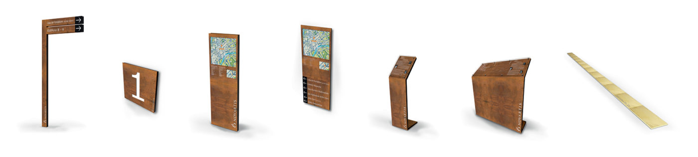
The products are unique, elegant and of high-impact, they are inserted in a wide and articulated context and create a clear directional path providing the user with all the information he needs. The customized solutions are made of COR-TEN steel with a visible internal frame in galvanized and black painted aluminum, signs, arrows and Novartis logo are laser-engraved, this process guarantees precision and sharpness of the cut. For this project many supports have been designed and installed, such as the Freestanding Directories with 2, 3 or 5-arms, the functional lecterns dedicated to the explanation of the points of interest, the freestanting totems with the indications of the plan and of the buildings. On the site, Flex used various small identification plates and produced the original path made of polished brass-finish steel tiles indicating the historical underground path of Bottini (XII – XV).
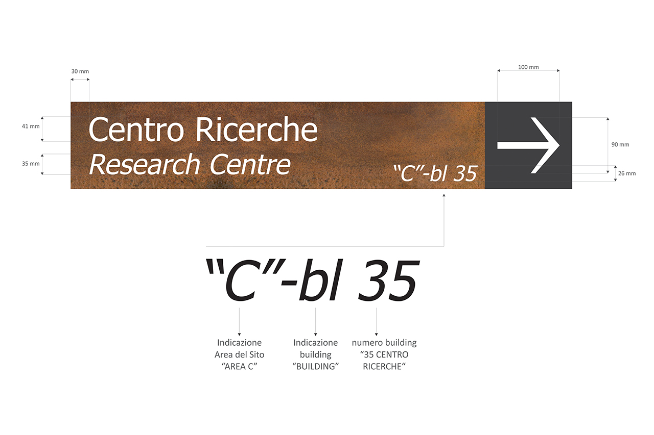
FLEX took special care about the design of the external directional signs, studying in detail all the elements to make the information clear and legible as much as possible.
The “Tahoma” text is the font that, according to specific studies, is the most suitable and immediate for information and signage.
Graphics have been developed with double language and identification codes have been included to identify each point of interest, building and area.
The identification codes have been included also on the map of the site for an immediate orientation of the user.
Products have been designed and built in a very short time, they have been positioned and installed on Novartis site (GSK) strategically, taking into consideration all the aspects related to the routes, the pedestrian flows, the points of interest, rest areas, entrances and exit. A very important aspect of the project is the consistency of the products which blends perfectly with the environment, without being invasive or excessive. The wayfinding elements are able to emphasize the environment giving the impression of an accurate place, exclusive and in which history is an important element. A correct wayfinding system helps the user to orientate himself on the site giving impression of professionality and efficiency.

No Code Website Builder